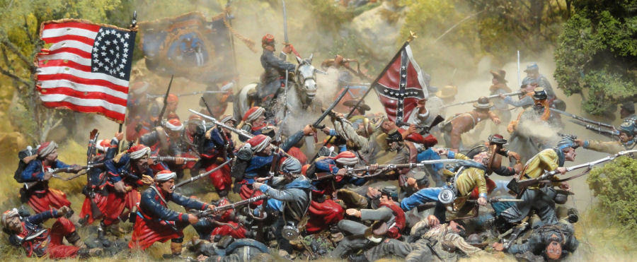

It's mid July, 2012. I recently obtained a bunch of Collector's Showcase Civil War figures from a collector who was switching his collecting interest from the Civil War to other eras. Among the figures I obtained were a bunch of 146th NY zouaves repainted as 5th New York zouaves...which, when teamed up with my Conte 5th NY zouaves, gives me a pretty good sized force of this colorful regiment. And so I got motivated to play again. This is the story of the evolution of the scene.
I first set up the figures to be photographed from the side.
I wanted to show off the repaints in a scene of the 5th NY routing the Texas Brigade. I also wanted to use the wooded, rocky hill I had recently made. This was what I came up with.

I had also used my pond scenic piece in the set up, I added some more figures and tried a higher angle shot so the water would show, but the lighting is too bright.

I tinkered a little more with the figures and added some smoke. I really wanted to highlight the zouave with his bayonet extended.

This was an attempt to digitally make the pond into a river. I was quite pleased with this picture at first, but the more pictures I took, the less I liked it...if that makes any sense.

The next phase of evolution was to widen the shot and clone in some more figures on the hill top at the left. I do like this shot, but it is just a mass of color in the foreground. The individual figures don't stand out. (But I do like the way the river turned out.)

I wish I could get better depth in pictures like this. I like the clarity of the foreground, but there's just something off about the figures toward the rear. Still, this is a keeper.

This picture is the culmination of my original concept for the scene. I think I might get a big print of this one and hang it on my wall.
Then a funny thing happened...I took the camera off the tripod and placed it in front of the scene, It was from an awkward angle so I couldn't really preview the shot in the viewfinder, I set the timer and....this is what I got.

I liked it, though I had to do the irregular crop job to take out all the junk in the background.

I tired again, this time going for a straight on shot. Hmm....this is cool except for it looking like the Confederate officer in the foreground is shooting his own retreating soldier...and the lack of features on the face of the Zouave withe knife...

So I removed the officer figure, repositioned the hand to hand vignette in the center, added a few more casualties to the front edge and got this. This is another shot I'm tempted to get blown up for wall art.

I moved the camera to the left and got this.

Here's a wider shot from the same camera position.

I really wanted to get the Zouave clubbing as the centerpiece in this shot. I had moved the wooded hill piece to the rear of the scene.

Here's the full width of the set up.

The next evolutionary step was to move forward in time a little and show the rout a little further along.

I lowered the lighting, thickened the smoke, moved a few figures around...and got this. This one makes me smile.

I changed the sky-background to the sunrise poster. I also added the Collector's Showcase Mosby figures to the right to give the sense of the cavalry coming in to try to slow down the advance of the Union troops by hitting them on their flank. This would be my favorite picture of all if not for the bent sword in the central figure's hand. Everything else came out perfect.

This picture has a little different feel due to the lighting, but it has the same problem with the central figure. Grrr....

So I straightened the sword and got this. I like it! Except for the way the raider with the pistols looks too short due to the rut he's standing in. There's almost always an "except for".

So I raised up the raider with the pistols. Pretty good...except for the hole in the action under the pistol smoke and the ever-frustrating flag on the right flipping down instead of flowing behind the rider.

Here's a closer view of the left center...

Here's the right center.

As the end neared, I changed the lighting again and moved some figures into the hole in the action that had bothered me.

The whole series culminated in this shot. I love that it has that oil painting sort of feel.

I took a few pictures from the side before I put the figures away.

I love the face of this Conte figure.

The aftermath.


